
Attest is a research platform that helps you reach and understand your customer audience with ease by testing with more than 100 million panelists from around the globe.
Product designer, Product manager and 4 Engineers.
We had a lot of symptoms of the problem but the actual issue was that simply the drafting experience wasn't easy to use, optimised or even aligned to how our users actually drafted surveys. We had a great experience that was optimised for routing which is probably one of the most advanced I've seen in a tool, but that also meant that it wasn't great for drafting. A pure design problem was also that a certain question was defined and created in a very small space that wasn't adapting to what question it was or even what you're trying to do and the information architecture didn't quite make much sense.


The goal we put for ourselves was to create a great drafting experience and enhance the current routing process. In addition we also decided to look at the information architecture and layout of the survey listing page as well as the audience and review page, so they match the new flow and experience. Lastly making all of that less complex and easy to use.
Any damn fool can make something complex, it takes a genius to make something simple.
- Pete Seeger, Product Director at Docusign
We decided to start a research on how people use our platform at the moment, what frustrates them with the experience but also understand how they usually draft surveys outside of Attest.
I started by setting up user interviews with some of our clients to understand frustrations and in addition to that I organised user interviews with people from our sales and customer support team. I also looked at Intercom support tickets that could put some light on the matter.
Meanwhile I published a poll to our customer base to understand how they rate the current experience and get some extra insight to what didn't go that well during their drafting experience.

That not only gave me more insight to the problem, but gave me focus on which users to interview.
Your most unhappy customers are your greatest source of learning.
- Bill Gates, Microsoft
By doing all the above I managed to pull together an excel sheet where I could log all the issue and later on by card sorting we managed to clasify them and put them into buckets of issues, which then helped us score them by how many times they came up.
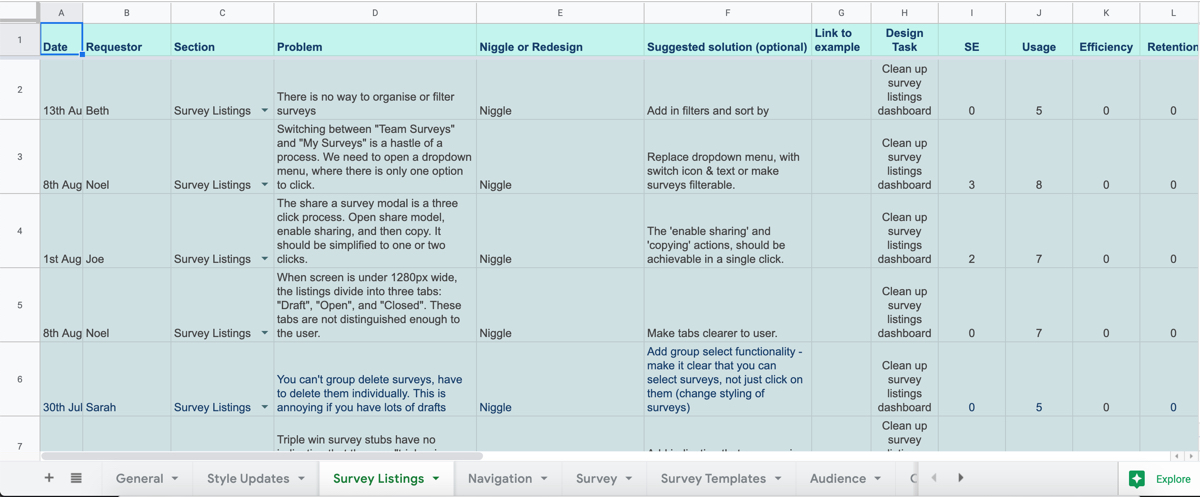
This also helped us build up our personas and a journey map that helped us focus on the bigger issues that we identified. The drafting experience was clearly the first weaker point in the journey and was what we were focusing on.

After that I started looking into the data we had from Fullstory and Pendo which gave me more clarity on the type of users we have at the moment, how long do they spend on drafting and what devices they use and how do they use our product really. We found out that the activity in the drafting screen was way higher then the rest of the platform. Our top users were people in Marketing and 90% of them used Desktop. In fact 90% of the 10% of our mobile traffic was on the result and login page, meaning people tend to draft on desktop and bigger screens, but sometimes view results on the go.

I found out that the activity in the drafting screen was way higher then the rest of the platform. Our top users were people in Marketing and 90% of them used Desktop. In fact 90% of the 10% of our mobile traffic was on the result and login page, meaning people tend to draft on desktop and bigger screens, but sometimes view results on the go. Another interesting insight was that very few people would create a survey and pay straight away. They would go back to a perticular survey numerous times, check for errors or even send for approval before they purchase it.

One interesting finding was that although the value for our customers is on the Result screen and we get a lot of views and shares, but the screen they spend the most time on is the drafting one. This just highlighted how important it was to get that page right.
I also managed to get hold of some of the files that clients create while coming up with a survey and it was quite interesting to see how they organise them in excel and Visio. Some people were more interested in the routes while others in the questions. One common thing was the anatomy of the survey and how it was organised. This is where the idea of creating a real-life like drafting experience came from. That also gave us the opportunity to reduce the cognitive load later on especially for first time users.

There were tons of issues with the information architecture in the creator as well as in the question taxonomy itself. That's why I started collecting all the bits and options we had for each question type and started organising them into buckets, so later on the question types had similar behaviour which therefore would make it easier to remember and use.

I also started doing some competitor research to see not only how they solve similar problems, but also to see how they organise their tools. While there wasn't a perfectly matching pattern between them they had a lot of similarities between them.

Now that we had a better idea what to focus on and how to approach the issue, I started coming up with rough sketches and ideas on how to tackle these. The main idea was to separate out drafting and routing and create great experiences for both. The difficult part was to figure out how to link them up. I started putting the ideas into wireframes and clickable wireframes that went trough a lot of iterations before we started testing some of them.


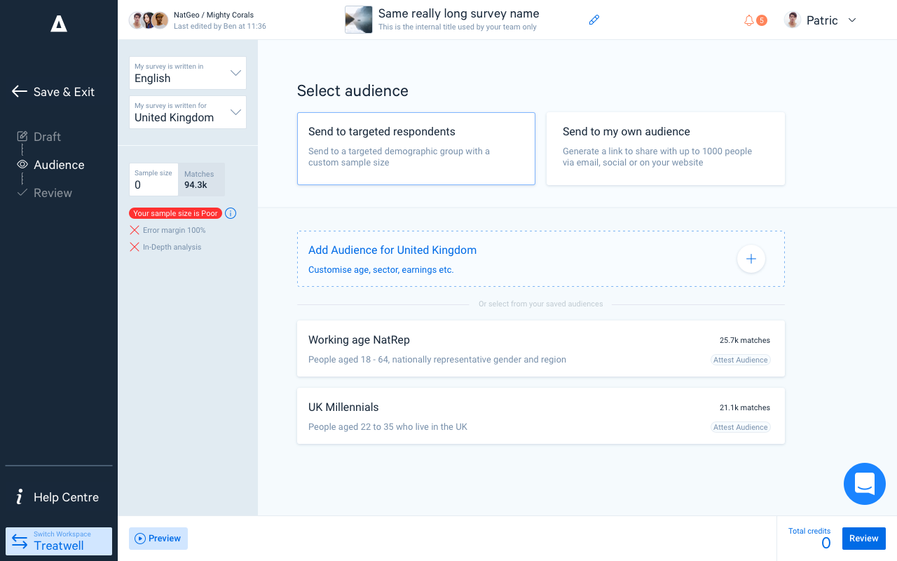
User Flow | Screens v1.0.0 | Prototype v1.0.4 | Prototype v1.0.6

There were quite a few things that came up in the testing sessions like the errors on text cards and how they behave, randomising question order as well as a lot of small details like sign posting and onboarding, but the main topic and issue was that our "density view" performed much worse than the zoom version. On top of that most of the interviewees were comparing that with the browser zoom feature once they understood it.
Oh, so it's just a zoom in zoom out feature basically...
- Ajay, Deloite Pixel
Another interesting insight was that although it took less time to have a selected question in the first place, it took testers more time to process than just having the two options of adding a question or text, which goes back to our goal to reduce the cognitive load.

That basically gave us the green light to rip out and forget about the density view and do a lot more changes to the flow to make it simpler. On top of that convincing people about the one or the other made it much easier, especially when you have data and video to back it up. At the same time I started working on our new visual language, grid and component library that helped the dev team to speed up their work significantly.

After we went trough couple of rounds of testing, we found out that there were some crucial transitions that we had to make right. The transition for the zoom in/out was probably the most important one, but also question selection in routing view as well as better error handling, which was more complicated as we had errors across two views as well as just top survey level errors, which meant we had to come up with an error log of some sort.
We also had quite a few very positive comments and feedback which reassured us we're going in the right direction.
All in all not much has changed, it’s different but really easy to use… it still feels like Attest.
- Hayley, Discovery
For some that might actually sound bad, but we knew we had to keep the experience similar. We knew routing was already a feature that users loved and we had to build on top of that rather than changing everything.


Lastly with the new grid we managed to simplify a lot the checkout screen which included the title and survey level error handling. We also removed the payment modal for subscribers which was costing us 30% dropoff at the last step.

on avg less spent editing
happiness score
MAU increase from 283 p/m
There are a lot of features that we had to postpone for after the main launch, meaning there are loads of things that still need adding in, like the error manager or editing in map view and many more to improve the experience even more, as well as focusing on how we bring collaboration into the tool. Unsurprisingly once we added features like view-only mode and comments, the time spent on the editor increased by 20min on average.