Hopin is a collection of tools for live events, webinars and networking focused on helping people feel closer.
Product designer, Product manager, Engineering manager, 7 Engineers, QA, Data Analyst and a Researcher. I was also working cross-pod with the mobile, networking and design system (planetary) pod.
Many attendees were finding the Hopin experience disorienting and were confused about what 'is going on', or ‘where to go next’. Attendees were also missing out on important Q&As, polls or segments they are interested in.
Improve wayfinding and find ways of grabbing the user’s attention in order to maximise their engagement and the ability to find what they need at the right time.
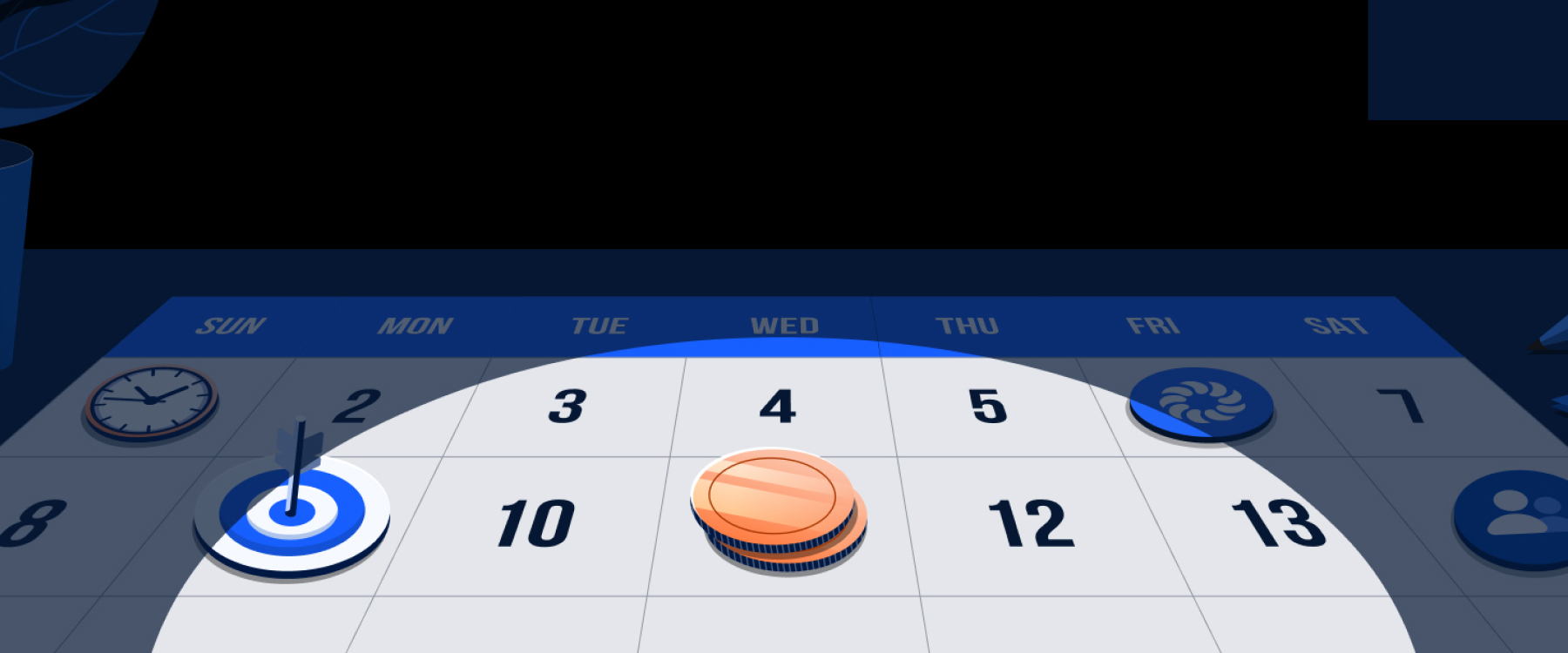
Our minds quickly forget finished tasks. However, they are programmed to remind us incessantly of those that we do not finish.
- Dr. Bluma Zeigarnik
I was tasked with leading the design and supporting research for the attendee experience tribe vision work. I ran a few workshops to get a better understanding of our product. Our research team was simultaneously working on defining our user personas a bit better. We already had a lot of insight from Productboard as well as the research team and together with their help we mapped out the event experience journey.
This already gave me a good idea of where we were and where the gaps are. Meanwhile I started looking into the data with the help of the data analyst. An average event has 16.5 segments on the schedule (Stage, Session & Networking), and for 65% of events this increases to 18 segments. Each of these segments has it’s own DMs, polls, Q&As and even third party apps. To navigate events, attendees need to remember to leave what they are doing, check the schedule, remember and go back. By then they might also miss out on other important information.
Findings from 3 research studies based on 30 Organizer/Attendee interviews highlight that the biggest issues users face when interacting with Hopin events’ are confusion around “where to go next” and awareness of activities requiring their attention DMs, meeting invites, newly published polls or chat messages directed at them.
To tackle that we had to break down the problem even further. We decided to focus on few areas and distribute them between teams. Some of the ideas trickled down from the executive vision presentation I did based on the work I led with the attendee experience design team. The main pains were:
Grabbing the user’s attention at the right time Difficult to know what’s on Contextuality of the schedule Navigability and information architecture
I took the first two issues. A newly released feature called “guided events” was used to guide people throughout the event. We knew that worked well for single track events, but it was more complex when it came to events with multiple segments running at the same time. This also didn’t solve the issue with in-segment activities.
I started ideating and thought that having something contextual to the “space” you’re in might help deviate some of the problem. This is why we came up with the hypothesis that if we were to notify people about all these things at the right time, then this would help with navigating as well as being more engaged during a segment. There were few ideas on the table:
Reminders for segments Push users to the relevant area in the sidebar Show notification previews for items in the NC Define an area in the reception for what’s happening now
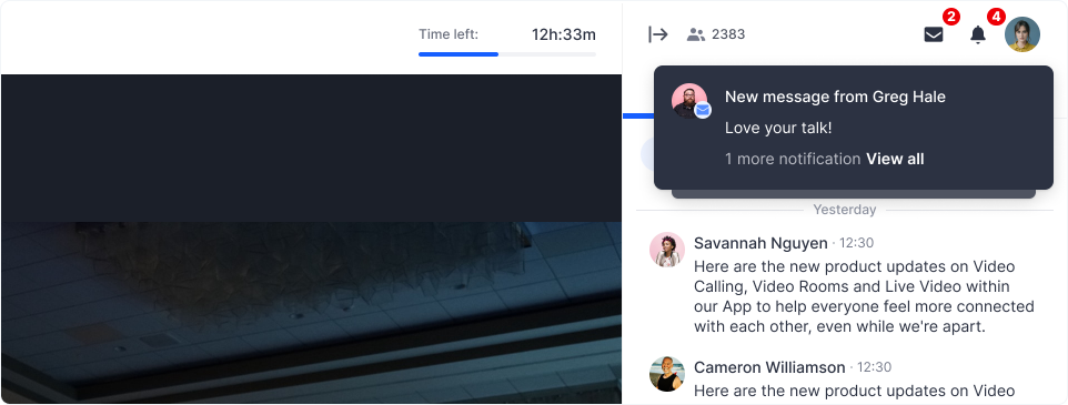
The quickest experiment was trying the preview notification which also captured most of the scenarios we were building for. This is why we set out to build an MVP of a notification centre which would prove the usefulness of DM notifications. Using the zeigarnik effect meant that showing some sort of preview was probably going to grab the user’s attention while still allowing them to focus on the segment.

I ran a couple of user test with attendees, showing them single and multiple previews to figure out the right timing and positioning. Showing multiple previews wasn’t an option as the whole sidebar was a primary engagement area that was used by the chat, polls and Q&As. That’s why it was decided that the best way forward would be to stack them, so that people could still focus on the main engagement tools without being interrupted. I also ran a few tests to find out what would be the best amount of time for these notifications to be shown. From the research I found out that an average attendee had to see a single preview for at least 10s. Based on that I was able to define some of the rules of how previews should be shown and how they would behave.
After launching the experiment with 6% of our user base, we saw an uptake of the % of attendees sending a DM. We also observed a correlation between the number of previews seen vs DMs sent. The number of DMs that attendees were sending increased fivefold after releasing the DM preview.

The hypothesis was that previews and notifications in general expose features that people weren’t aware of.
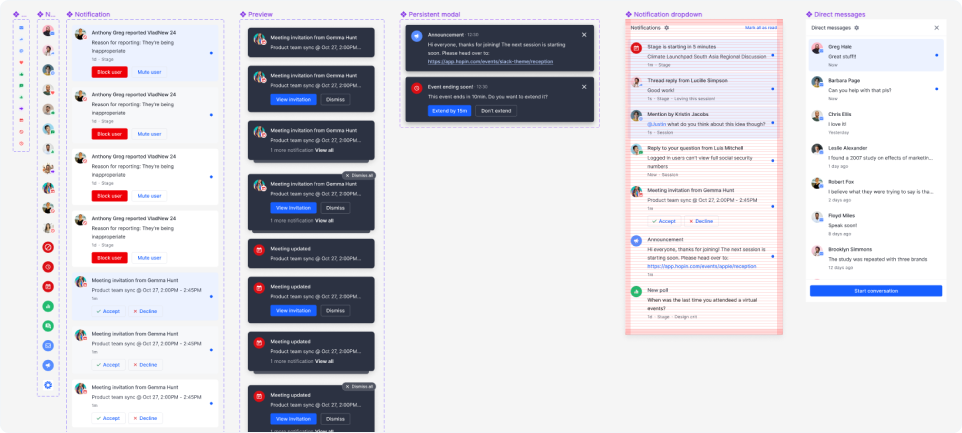
Based on that data, we decided to start rolling out more of these notification types. We started exploring segment notification reminders followed by organiser driven ones like Q&As and Polls. The fact that we started having more and more of these meant that I had to also start thinking of how previews will be ranked. What’s the trumping behaviour and what are the context aware rules we’re going to have, so we always show the most important and relevant item to the user.
I started defining them in a more detailed matrix that later helped other teams roll out notifications (such as meeting reminders and mobile notifications) as well as documentation around the trumping behaviour, ranking and mobile specific rules.
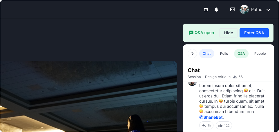
Organiser driven notifications were slightly different, as they were exposing activities happening within a segment, which is why we approached them with a slightly different perspective. I thought that a persistent type of notification or pushing them directly to the area where the action was happening would be better. After testing out a few options it was clear that pushing them to the area deemed too disturbing by attendees., A persistent preview was received better than the regular preview and much more useful.
While these suggestions were superior they were time expensive, which is why we defaulted to the second most popular option which was just reusing the preview we had already.

Once the polls and Q&A notification types were rolled out, we saw similar and encouraging data.
7.4% of attendees who received a preview notification asked a question in Q&A vs only 2% who did not receive a notification
37.1% of attendees who received a preview notification responded to a poll vs only 5.5% who did not receive a notification
This meant that the mobile and communications team were also able to start adding some of these notifications into their product area.
I also worked on improving interactions in the notification tray and started creating components for the notification centre and collaborating with the planetary team (design system team).

number of DMs sent
asked a question
responded to a poll
Currently I'm leading a cross-pod initiative on the “What’s happening now” area in the reception which would promote current live segments as well as trending engagement highlights from around the event.
